Tuesday, January 31, 2012

Tip #77: From the Seminar

Yesterday, I attended Scott Kelby's "Light It, Shoot It, Retouch It" seminar. Five hundred of us were taught and entertained by Scott and his staff, as Scott went through the steps in the different processes. I learned a good deal about setting up portrait sessions with live models, product shoots, and how to retouch each of the styles. The seminar was balanced between lighting arrangements and the use of Photoshop to retouch and produce the final images. I also learned about tethered shooting and why it is important in the studio -- a two inch screen on the back of a camera is just not large enough to make good lighting decisions. I can definitely recommend attending one of Scott's seminars, if you get the chance.

As with most seminars, there was an opportunity to hear about new products coming to the market to make photo editing chores less tedius. Two vendors jumped out at me. I recomend a visit to both companies' websites.


[Back to the Main Site]

Monday, January 30, 2012

Tip #76: More Organization -- HTML Tables

What if you need more than bullets and enumerations to explain a complex task? The answer may be tables. You know, rows and columns of information. Here's how you can add a table to your blog page, and, you've guessed it -- a future article will explain a complex task with lots of information. Instead of too much text, I will display the how-to in a table.

First, here's the sample table:

X O X
O X O
O O X


Next, here's the code, used to create the table:

<table border="5">
<tr>
<td>X</td> <td>O</td> <td>X</td>
</tr>
<tr>
<td>O</td> <td>X</td> <td>O</td>
</tr>
<tr>
<td>O</td> <td>O</td> <td>X</td>
</tr>
</table>


Tables can be useful for text as well as for images. Additional details on the use of html tables can be found at W3Schools.com.


[Back to the Main Site]

Sunday, January 29, 2012

Tip #75: Lists on Blogs

Sometimes, when writing articles or tips or notes, you need to enumerate the steps to a solution or list bullet points to emphasize the main points of your discussion. In this collection of "how-to's" I have used both kinds of lists, and I have wondered out loud, why the blog editing tools do not have bullets and lists included. Here are examples of each and the code needed to make them. The tags are simple and differ, only, by a single letter: <ol> or <ul>:

Ordered list (enumerated):

  1. Lorem ipsum dolor sit amet, consectetur adipiscing elit.

  2. Nulla semper nulla ut quam fermentum vel vulputate est ultricies.

  3. Donec at diam sit amet justo fermentum pulvinar ut a nisi.

The Code:

<ol>
<li>Lorem ipsum dolor sit amet, consectetur adipiscing elit.</li>
<li>Nulla semper nulla ut quam fermentum vel vulputate est ultricies.</li>
<li>Donec at diam sit amet justo fermentum pulvinar ut a nisi.</li>
</ol>


Unordered list (not numbered):

  • Pellentesque quis libero vel ipsum cursus tincidunt.

  • Phasellus facilisis enim id tellus ornare vestibulum.

  • Nunc pretium arcu ut felis elementum ut viverra mi faucibus.

The Code:

<ul>
<li>Pellentesque quis libero vel ipsum cursus tincidunt.</li>
<li>Phasellus facilisis enim id tellus ornare vestibulum.</li>
<li>Nunc pretium arcu ut felis elementum ut viverra mi faucibus.</li>
</ul>


I hope this helps you get your points across!


Note: Here's a quick follow-up. I was working with my blog tool, blogger.com, when I realized that I always write in the "edit html" mode. When I accidentally clicked on "compose" mode, guess what I found. I found buttons to automatically add ordered and unordered lists -- imagine that. The moral of the story is, don't get stuck in a rut!


[Back to the Main Site]

Saturday, January 28, 2012

Tip #74: Simple Masks

We all wear them. They hide what we don't want seen. The same applies to photo composites -- images made up of more than one picture. Masks can be complex or simple. They can range from merging gradients or just shapes that block-off a portion of a picture. In a recent posting, I created a triptych, using three photos, a layer for each, a mask for each layer, and a background layer. My layers were named background, top, left, and right, so I could keep track of where the photos should be placed. Why all the trouble? Well, with the different layers and their masks, I can drop photos onto the different layers without disturbing the other parts of the image. It is like stacking the different images (layers) with restricted views (masks) of the different layers.

Here are the steps.

  1. Create basic layout.


  2. Create mask for each portion of the image, top, left, and right.


  3. Save the layers for use as a template, which can be rotated, enlarged, or used, as is, for future composites. This is usually the native file type, used by your editor; jpeg files do not save the layers, just the merged result.


  4. Add each image to its own layer.


  5. Add or change the background color with the flood fill tool.


  6. Save the final image, merging all the layers.


Note: This example was done with Paint Shop Pro, but the steps apply to whichever layers-capable editor that you might be using.


[Back to the Main Site]

Friday, January 27, 2012

Tip #73: Spot Removal

Technology has changed the way we edit photos. New improvements to editors have taken some of the pain away. For instance, spot and blemish removal used to require painstaking recoloring at the pixel level. Then, the clone stamp brush was created. With this tool you copied a small region of your photo, near the spot, and you copied the similar region to overlay the spot. Again, this was tedious at best.

Modern editors now have sophisticated improvements that remove spots with a single click. You adjust the size of the brush, click on the spot to be removed, and the tool blends the spot away. When you open your editor, look for retouching tools. For example:
  • In Google's Picasa the spot removal tool is called Retouch.

  • In Adobe's Photoshop the tool is called Spot Healing

  • In Adobe Lightroom the tool is Spot Removal

  • In Nikon's Capture NX2 the tool is Auto Retouch Brush

If you care to see sample tutorials, check out www.nikonusa.com or try the Lightroom tutorial.


[Back to the Main Site]

Thursday, January 26, 2012

Tip #72: More Photographic Training


In previous tips I have described the pros that I follow. I have provided links to their sites, and I have offered up camera maker sites that provide tutorials. I would be remiss in not pointing you to specific sites that I use to learn more about my blossoming craft.

My favorite trainer is Scott Kelby. Scott has blogs and sites that offer free and paid-for instruction. Scott also does nationwide tours. In fact, I am attending his "Light It, Shoot It, Retouch It -- Live" seminar in Austin on Monday. I am sure I will come out of that training with a whole set of skills for which I was previously unaware. I am looking forward to 8 hours with Scott.

  • For starters and for free tips try KelbyTV.com

  • For more in-depth, but paid-for instruction, try KelbyTraining.com

  • And, if you get a chance attend one of his live seminars. I'll have more to say on this topic, next week.


Note to Boss: Yes, I am taking a vacation day.


[Back to the Main Site]

Monday, January 23, 2012

Tip #69: Use Picasa to Date-Stamp Your Photos

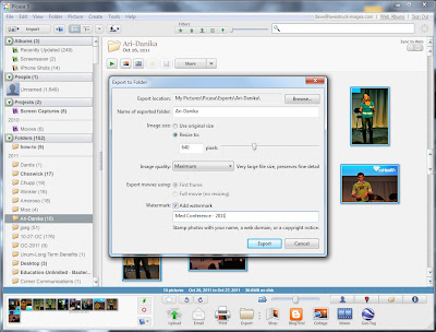
If you are sharing photos online or as prints and you want your audience to know the date or event, where the photos were taken, here's a quick how-to for adding a that information to your photos, using Picasa, the free photo editor from Google.

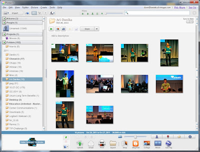
1. Open Picasa and go to your directory of choice:


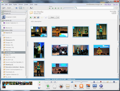
2. Select the images to export:


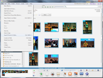
3. Choose File | Export


4. Complete the Export dialog and click Export:


5. View the results:


Easy, huh?


[Back to the Main Site]

Sunday, January 22, 2012

Tip #68: Shooting Flowers

Some say, buy a pretty flower, bring it home, arrange it just so, shoot it against a black background, shoot it against a white background, or some other "recipe"; but I prefer to shoot flowers in their natural state. I do have to put up with wind and bugs and somewhat trying conditions to get the best angle, but I think it is worth the trouble.

I look for nice color contrasts, and I usually shoot with a telephoto lens. I try to capture images up close and with an unusual angle to be different. Just like shooting children, I try to get on the same level as the flower. This shot was captured near sundown. The setting sun was illuminating the flower, while the blue sky was providing a rich backdrop. The sunflower called to me.


For this shot my settings on a Nikon D40X with 55-200mm F/4-5.6G lens were 122mm, F/5, 1/250s, ISO 200.


[Back to the Main Site]

Saturday, January 21, 2012

Tip #67: Camera Manuals in the Field

You are traveling to the field to shoot a project. You remember that your camera had the necessary feature, but you cannot find the menu to set up the feature -- if only you had brought the camera manual. You know that 150 page document that you saw in the box, when you brought your new camera home.

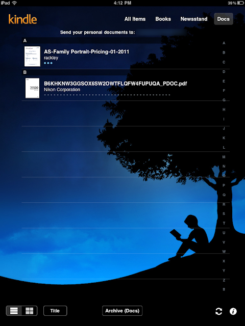
Well, kindle -- I happen to use the kindle app on an iPad -- has come to the rescue. A recent update allows you to upload personal documents and PDF files straight into your kindle-reader. I just uploaded the PDF versions of my camera manuals to my kindle account. It was as easy as sending an email -- in fact that's all you have to do.


Detailed instructions are on Amazon.com.


[Back to the Main Site]

Friday, January 20, 2012

Tip #66: File Storage and Sharing

Have you ever needed a place to store your photos, so you could get to them from anywhere? That need was answered for me by www.dropbox.com. You can create folders for your files, then share those folders with as many or as few as you like.

Creating an account is free, and you instantly get 2GB of storage. As folks login to retrieve your shared files, you get additional 250 MB added to your account. If you need more storage, then you can purchase it 50GB chunks.

Uploading files is easy via either a web interface or a desktop files manager interface. The latter being as easy as drop-and-drag.

Be sure to watch the introductory video to get the "big picture".


[Back to the Main Site]

Thursday, January 19, 2012

Tip #65: Vignette, Oui, Oui

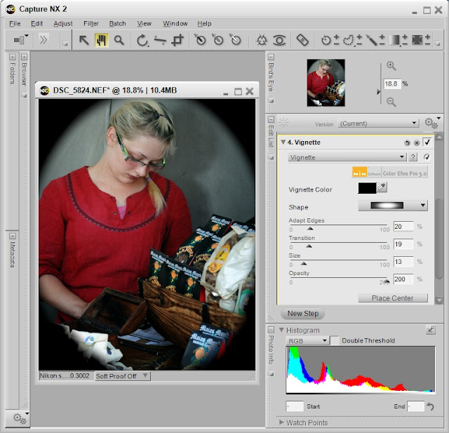
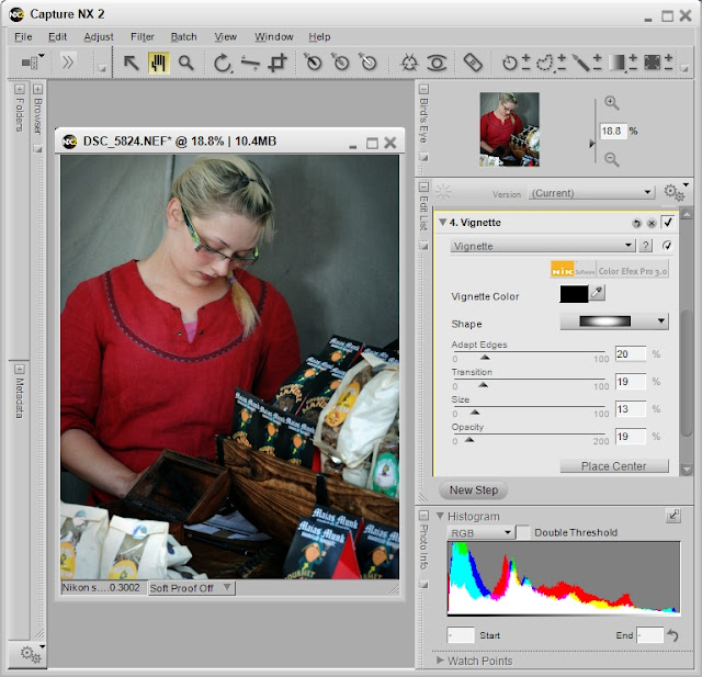
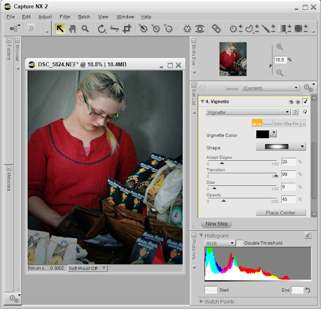
Oh Vignette, you are sassy and tart. Too much and you are obvious, too little and the eyes stray, but just right and you are so, so subtle. In photography, vignetting is the darkening of the outer edges of an image, so that the viewer's eyes are kept on the subject of the photograph. Done well, and the effect is barely noticeable. Done poorly and you have nothing but a dark circles around the edges of your images.

Here is an example of an exaggerated vignette. It is purposefully done poorly to identify the effect.


Here's an example that is a bit more subtle.


Here's the effect done just to my liking.


BTW, I used my main editor, Capture NX2, for these examples.


[Back to the Main Site]

Wednesday, January 18, 2012

Tip #64: Curves Tool

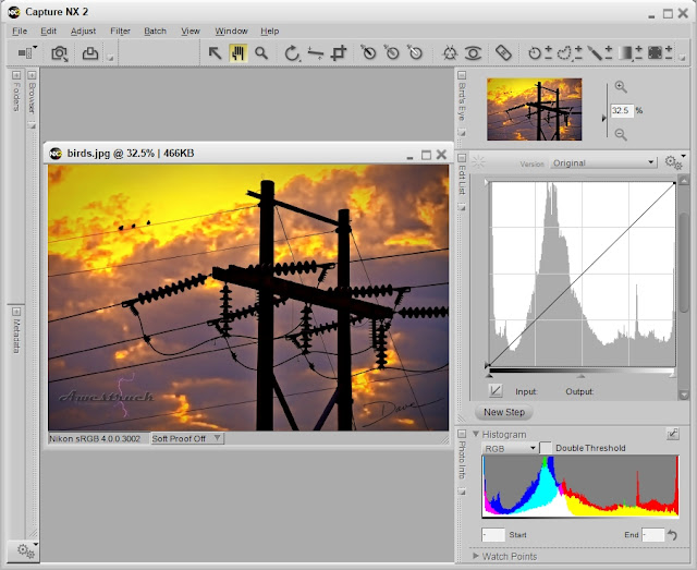
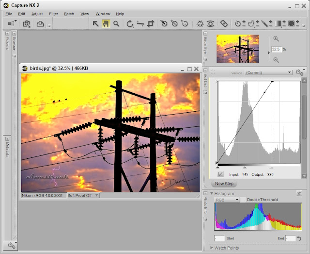
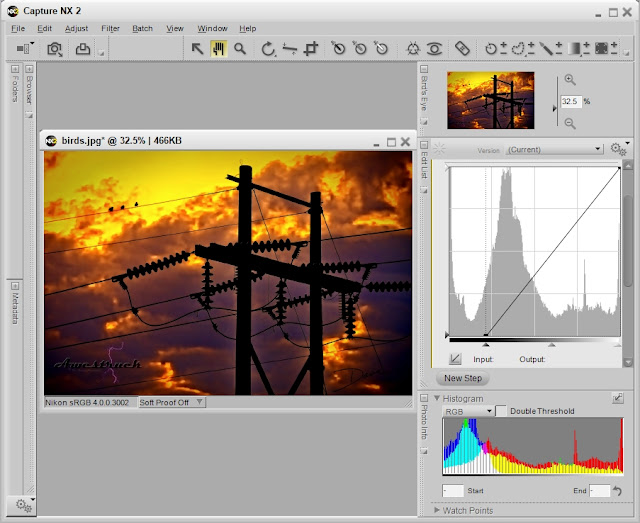
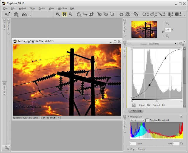
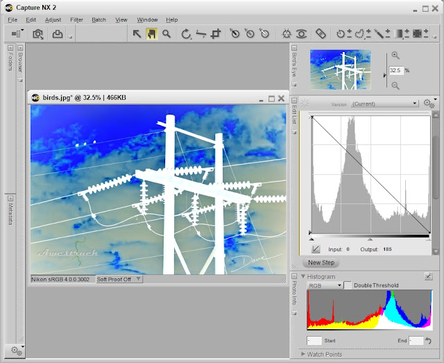
Most higher-end, image editing software has a powerful tool called curves. The mathematical nature of the tool seems intimidating, so some avoid trying it. In simple terms the curve(s) tool displays and allows changes to the relationship of input to output tonal values. Scary, huh? With the following examples, I hope to take the scary out.

When an image is first opened, the curves tool displays a straight-line relationship, overlaying the histogram of the image. In other words the input tonal values of an image matches the output tonal values. The following screen shot from Capture NX2 shows this relationship.


You can lighten an image by adjusting the far right slider on the bottom toward the middle.


You can darken an image by moving the far left slider on the bottom toward the middle.


For portraits, an S-curve is often used. Just click on the line and adjust it to form an s-shape.


You can create a negative of your image by moving and reversing the end points of the line, until you have a negative slope -- oops, there's some math, again.


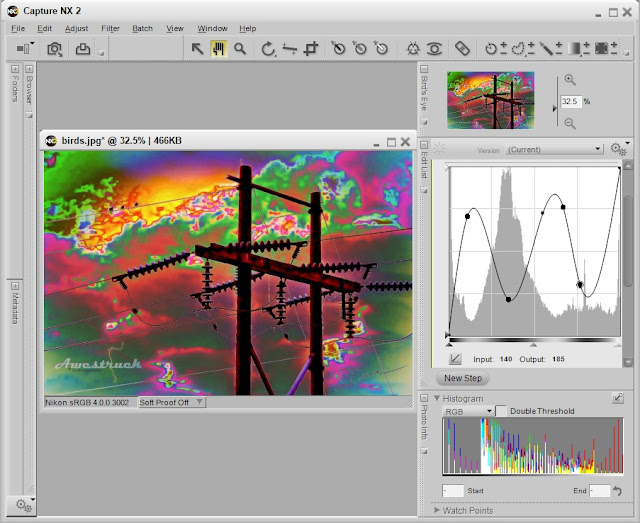
You can even go psychedelic, if you make the curve perform unnatural acts.


Of course there are other examples. See more at Cambridge in Colour.


[Back to the Main Site]

Tuesday, January 17, 2012

Tip #63: Non-Destructive Edits

Choose your photo editor carefully. Better yet, understand what your editor does, when saving an image. Some editors are destructive, meaning when you make changes to an image and save the changes, the original image is overwritten. Unless you were working on a copy, the original file is now lost.

The Picasa editor, which I have mentioned in previous tips, makes a copy of the original file and stores it in a folder within the directory holding your images. That is fine and good until you choose to clean-up your files and delete the directory containing the original files. All is not lost, if you made a copy of your images in a another location.

Some image editors are non-destructive, meaning you can recover the original file. Capture NX2 is non-destructive. It actually saves the changes in the original file, if you are editing NEF (raw) files -- changes are not saved to jpeg or tiff files. Of course, I always have back-ups of my important images, just in case things go badly and files become corrupted.

Photoshop makes destructive edits, unless you do the smart thing and duplicate the original image layer with a new layer. Your edits should also be made with adjustment layers. Otherwise, you may lose details in the original image. See more on the topic at Photoshop Essentials.

If you find that your editor is completely destructive in nature, be sure to copy an image and save it with a new name, before you begin your edits. I recommend that you edit the copy, so that the original remains unchanged.


[Back to the Main Site]

Monday, January 16, 2012

Tip #62: At a Loss for Words

This is another general blogging tip. Have you ever been at a loss for words or needed to fill a paragraph with sample text? There is help. For instance:
Lorem ipsum dolor sit amet, consectetur adipiscing elit. Donec eleifend neque eu nisl imperdiet gravida. Proin sollicitudin purus quis metus iaculis at hendrerit velit tempus. Suspendisse potenti. Phasellus elit sem, euismod eget tincidunt lobortis, condimentum consectetur turpis. Quisque sed neque at dolor sodales accumsan id nec magna. Ut auctor, felis at tincidunt sagittis, eros augue suscipit nisi, et accumsan est nisi eget justo. Mauris sed arcu non lectus hendrerit vulputate. Ut eget libero felis. Aenean lacinia tortor sed sapien rhoncus egestas. Nunc eu mi elit. Cras tristique dui vehicula nibh iaculis venenatis. Fusce odio tellus, scelerisque in tincidunt non, dapibus ac urna. Maecenas non lacus dui, vel pulvinar arcu. Maecenas eu lectus lacus.

If you need some of this, go to www.lipsum.com

If you would rather see a topic particular to photography, let me know the topic. I'll either wax poetically or do the research to prepare me for the topic. I'd love to hear from you.


[Back to the Main Site]

Sunday, January 15, 2012

Tip #61: Reviewing and Tagging Photos

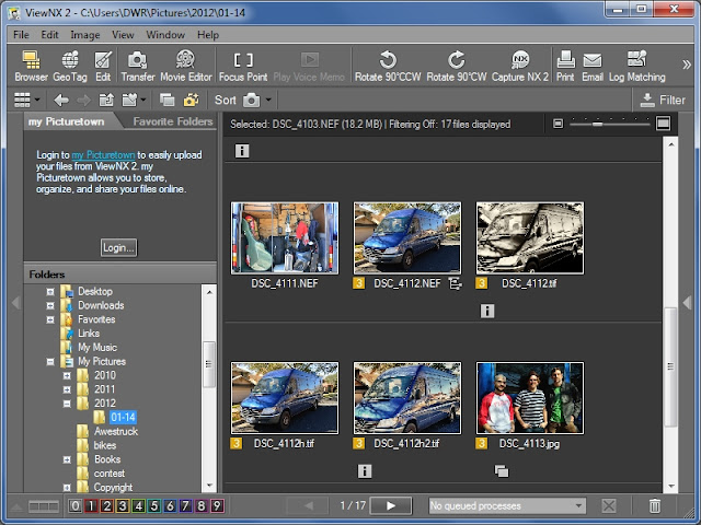
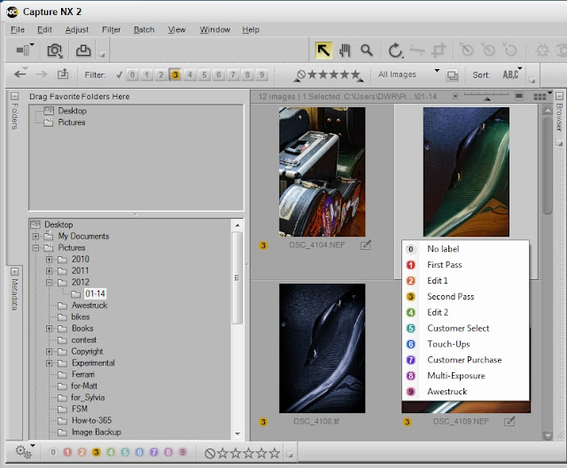
Not every photo that you take will be noteworthy, so you will need some way to score the images. In the workflow tip, I described my process for culling photos. Here's a bit more information. ViewNX 2 is the free software I use to do initial viewing and ranking. As I view each image, I click on a ranking button from 1 to 10. The ranking is stored in the image file and is available to my main editing software, Capture NX 2.


In simple terms a so-so image with no rank gets no attention during editing. A photo with a rank of at least three gets attention. For me, edited photos that have good potential for designation as "keeper" get higher ranks added during the editing process. As clients select photos for purchase, the rankings change, yet again.


These extra, ranking steps take almost no time to do, but they save me minutes to hours in the overall process of producing quality images.


[Back to the Main Site]

Saturday, January 14, 2012

Tip #60: A Funny Thing Happened on the Way to FB

A recent photo of mine has gathered many good comments. I appreciate the kind words and find them all encouraging. Regarding that photo, I want to tell you how I produced it and then follow-up on the interesting treatment that the photo has experienced. It's going to be a story much like lost luggage that comes home with more passport stamps than the owner.

First, here's the creation story. I was working in the darkened sound booth at my church, when I noticed the indirect light from the spotlight on the choir was creating soft shadows on my sound board. I sensed that the same light was softly lighting my face, so I set my iPhone on my knee, aimed the backside camera in the general direction of my face, and blindly snapped a shot. The result was a nice photo of the bulletin board behind me and about half my nose. I made a minor adjustment to camera placement and snapped another photo. This time I captured a grainy (low light) but well focused shot. Sound changes were coming up, so I pocketed my phone and went back to work.

When I got home I reviewed the daily images. The two-thirds self-portrait was an interesting shot, so I played around with it, using the Snapseed editor on my phone. I adjusted the contrast and added texture with the grunge filter, then I uploaded the photo to my PC. I fired up Capture NX2, loaded the image, and smoothed the excessive grain with a little noise reduction, then I brightened the entire image with a slight curves adjustment (more on that in a future tip). I finished the photo by adding my signature and copyright meta data. The resulting image is what I posted on Awestruck-Images, and later on Facebook.


The second half of the story is still a bit of a mystery. I have an idea of what happened, but I cannot confirm it. I posted the image in the usual way by posting a link to Awestruck-Images. I've been using that technique, successfully, since my early days on Facebook. The image thumbnail appeared as usual and the linked image stayed view-able on Facebook, long enough for folks to comment and "like" it. A couple of days later, the photo just disappeared from my timeline. I shrugged and attempted to reload the link. The image simply would not load. Again, I shrugged. I tried a different photo -- success. I tried the self-portrait, again -- failure. I tried posting the image directly to my wall -- success. About three days later the original link to the image, the "likes", and the comments reappeared as mysteriously as it disappeared.

I suspect that my copyright meta data was spotted by FB internal scanners, causing the linked photo to be blocked. The mystery is, why did the photo reappear? I cannot fathom that the FB search engines are smart enough to reinstate a blocked photo. Furthermore, I cannot believe that a human being became involved -- there are just too many millions of photos being uploaded for that to happen. So, I will shrug, again, and contemplate this mystery, much as I contemplate belly button fuzz.

What are the lessons in this tip? Photos, like beauty, are in the eyes of the beholder. A grainy, splotchy photo can have as much impact as a super sharp, detail loaded image. I think we call the effect, art.

Secondly, as all of you know, FB is not a vault for artful treasure, rather it is the social media service that we all get to use for free. Just don't count the ads and data mining that FB is doing each time we log on.


Note: Links to the software I use are in Tips #13 and #35.


[Back to the Main Site]
Friday, January 13, 2012

Tip #59: Facebook Cover Photo

The Facebook timeline format has a feature called Cover Photo. If you want to keep your timeline fresh and maybe a bit edgy, then add a cover photo. The proper dimensions for such a photo are 850 pixels wide by 315 pixels in height. If you don't want to create an image of that size, most any landscape oriented shot will do, if you don't mind positioning and cropping an image larger than the optimum size, when you upload it.

You can see an example cover photo on my profile page, http://www.facebook.com/David.W.Rackley


Don't have timeline? Want it? Go here, http://www.facebook.com/about/timeline, and look for the button that says "Get Timeline"


[Back to the Main Site]
Thursday, January 12, 2012

Tip #58: HTML Colored Text

If your blog editor is like mine, there are limited things you can do with text. You can probably bold-face it or make it italics, but you may not be able to change the text color. In the early days of html you would just use the <font> tag, but, alas, the <font> tag has been deprecated (phased out). The preferred method is to use the <span> tag.

I searched all over to find the replacement for <font>. Everyone insisted on using cascading style sheets (CSS). Well, for entire web pages, I agree, but for a single word or a single phrase, creating a CSS style for a color seems like code-bloat to me. Finally, I found the solution, and here it is for you to use.

<span style="color:orange;">Your Text Here</span>


Want to know more, see <span>


[Back to the Main Site]
Wednesday, January 11, 2012

Tip #57: Light Bender

In the Catch Lights tip, I discussed using a 3x5 card on your flash to bounce light and create nice eye reflections. There is also a commercial solution that I use, the Rogue Light Bender. I use the 10"x7" model.


The product attaches to my flash unit with a stretchy, Velcro strap. It folds flat and easily fits in my bag, and it can be shaped as a reflecting card or rolled into a snoot. It is a versatile accessory that provides nice, soft reflected light.


[Back to the Main Site]
Tuesday, January 10, 2012

Tip #56: Blogging with Links

If you have been watching closely, you have noticed at least two behaviors with links that I use in my blog articles. For links that point back to my own material, I let the new page open in the same window (or tab) as the original article. For links to external resources, I cause the new material to open in a new window (or tab). I do that for a couple of reasons: I want you to stay on my site, and I want the external links to come up in the format that was designed by that article writer. Here's how the code for external links work:

  1. Create the link in your article.

  2. Once the link is created, find the edit html link or button, and move to the code with your newly created link. It will look something like

    <a href="http://www.link-to-external-site.com">External Link</a>


  3. Add target="info" to the link, so that it looks like this

    <a target="info" href="http://www.link-to-external-site.com">External Link</a>


  4. Return to your normal editing mode and post your article. When your blog visitors click on your link, a new window will open with the external information that you have linked.


BTW, the word, "info", has no special meaning. It is just the name of the new window that opens up. You could call it, George, if you wanted to.


[Back to the Main Site]
Monday, January 9, 2012

Tip #55: Portable Disk Drives

In my workflow tip I mentioned that I transfer images to portable drives for storage. I use Seagate Free Agent GoFlex drives. For the price I get a good amount of storage, they are not the fastest but are fast enough, and they work with any Mac or PC with a USB port. I currently own a couple 500GB units; one is blue, and the other is red -- that way I don't mix them up.

If you shop around, you can find the 500GB units for less than a $100.


[Back to the Main Site]
Sunday, January 8, 2012

Tip #54: Black and White to the Rescue

Sometimes environmental conditions, especially stage lights that are constantly changing, prevent a picture from having the needed impact. In these situations converting the image to black and white may be just the answer. Most cameras allow images to be captured as monochrome images. I advise against that and recommend that you capture all the available colors with your camera, then do the black and white conversion in post processing. That way, if you decide you need the color, you will have it.

Black and white images make powerful statements, since we are all used to seeing images in color. So, mix it up a bit and try some black and white on your photos.

Image of Ashley, as captured -- pulsating stage lighting


Black and White conversion -- from blah to WOW!


[Back to the Main Site]
Saturday, January 7, 2012

Tip #53: Histograms

By now, you have stumbled across a feature on your camera that made you want to set down the camera and run away. On the other hand, you became frustrated that instead of viewing your just taken photograph your camera display is showing a graph of incomprehensible data. Have no fear that is just the histogram of information about the shot you just took. To get back to your photo, just use the up or down arrow control and change the display back to the photo.

The histogram is a tool that tells you about the exposure of your images. The histogram is a bar graph showing dark pixels on the left and white pixels on the right. The height of the bars is a count of pixels in each segment of the color range. More pixels on the left of the graph means there are more dark pixels in the photo, while more pixels on the right indicate a lighter photo. There is no perfect histogram, but a properly exposed photo will have a distribution of bars across the whole range of the graph. Easy, huh?

Still confused? Learn more with Ken Rockwell's excellent, visually oriented description.


[Back to the Main Site]
Friday, January 6, 2012

Tip #52: Bluer Skies

In the previous tip, I used a software filter to really make the sky turn blue. Is there an in-camera solution that will also cause the sky to be a bluer blue? Well, as it turns out there is a solution.

To get bluer skies, look for a camera setting, called exposure control. It will either be a button on a DSLR or maybe a menu setting on a point-and-shoot. Just set the exposure control to -1 and take your normal outdoor shots. The results should be a pleasing, richer blue-sky photo. Then, if you really want to, you can use the skylight filter that I used in yesterday's tip.


[Back to the Main Site]
Thursday, January 5, 2012

Tip #51: Skylight Filter

In yesterday's tip I reduced the noise from a pretty good photo. Today, I enhance the sunset in the same photo to make the image come alive. I got the idea of using the Skylight filter from Moose Peterson, renowned outdoor photographer.

With the image loaded in Capture NX2, I finished the edit by choosing the Skylight filter from the Color EFEX Pro 3 plug-ins that are integrated in my copy of Capture NX2. I liked the way the sunset went from drab to bright. Then, I added a second use of the same filter. The result was like magic. Tastes may vary on color intensity; however, the use of stacked filters is an idea that everyone can use.

Before Skylight Filter:


After Skylight Filter #1:


After Skylight Filter #2:


Now to reveal the finished edit, here's the photo before edits:

Photo -- Randy Wohlert (this was a self portrait -- camera sitting on a stump with a timer set)


And, here's the completed photo that I returned to my friend:

Edits -- Dave Rackley


[Back to the Main Site]

Wednesday, January 4, 2012

Tip #50: Noise Reduction

Except for a few special cases, I do not like noisy photographs -- you know, the grainy, speckled images that have taken over the social media sites of the world. I prefer clear, crisp images.

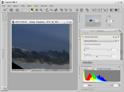
A friend recently asked me, if post-processing would help an image he had captured. Without even looking at the photo, I said yes. The first step in my editing workflow is noise reduction. Here's how I reduced the noise in my friend's photo:
  1. I loaded the image into Capture NX2.

  2. I zoomed to 100% and scrolled to a portion of the sky. The 100% zoom is critical for noise adjustments. The sky is where noise most often shows its ugly self.

  3. I chose the noise reduction tool, and I clicked on "Better Quality" and "Edge Noise Reduction"

  4. In this case, I moved the slider to 27%, the point at which the noise melted away.

Before Noise Reduction (click the image for a closer look):


After Noise Reduction (click the image for a closer look):


I will be revisiting this image with a future tip, so stay tuned.


[Back to the Main Site]

Tuesday, January 3, 2012

Tip #49: Eye-Fi

Have you been looking for an easy way to transfer photos, wirelessly, from your camera to a smartphone or tablet? Does your camera use SD memory cards? If the answer to both is yes, then this tip is for you. An Eye-Fi card will do this and more. It will even let you shoot with a direct connection between your camera and an iPad.

I followed Terry White's lead and set up my D7000 with an Eye-Fi card in the second slot. The primary card is set up to store raw NEF files. The camera is set up to write basic jpeg images to the second slot. I set up the Eye-Fi card to act as a WiFi hot spot, and I set my iPad to connect to the Eye-Fi. Now, when each device is powered up and "paired", a copy of my most recent shot appears within a second or two as a full-display image on the iPad. It's like being tethered but without the cables.

If you only have one SD card slot, that will work, too. Just use the Eye-Fi card in that slot. The WiFi functionality will be the same.


[Back to the Main Site]

Monday, January 2, 2012

Tip #48: Auto-Announce

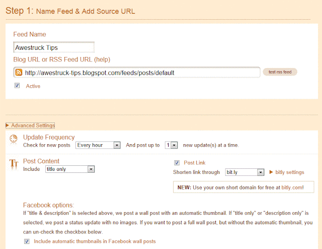
This tip is for bloggers in general. You don't have to be in photography to use it. If you have an active blog, and you like to announce the new projects on facebook , twitter, or other outlets, you will benefit from an automatic feed. You can use one of several resources. I happen to use twitterfeed. Here's what I did for this blog:

  1. Create an account on twitterfeed. It's free.

  2. Add a new feed, using a name descriptive to you.

  3. Set up the frequency of updates. I use the 1-hour setting.

  4. Set up number of postings to add to the external resource (facebook in this case). I use the value, 1.

  5. Set up optional prefix or suffix text. For my photo blog, I prefex everything with "New Picture: "

  6. Let the service run. As you create new blog posts, the service will automatically add project posts to your facebook wall or project page.


One of the necessary entries on twitterfeed is your RSS URL for your site.


Happy sharing!

[Back to the Main Site]

Sunday, January 1, 2012

Tip #47: Group Shots

Happy
New Year!


What do you do, when you have to shoot groups of people? One pro told me that he hires someone to pose and take group shots. He said it was less stressful on his clients.

There are a couple of quick remedies for taking group shots -- avoid long straight lines of eyes and make sure the person that is paying is in focus. Think triangles or clusters of three faces, and you will avoid the eyes-on-a-line problem. Keeping everyone in focus can usually be achieved by using small f-stops, such as f/8 or maybe even f/11, if there is adequate light.


Happy
New Year!


[Back to the Main Site]